


Running a Shopify store is exciting, but it also comes with challenges. One of the biggest is making sure your store looks and works perfectly on every device—whether your customers are shopping from a laptop, tablet, or mobile phone. That’s where responsive design comes in.
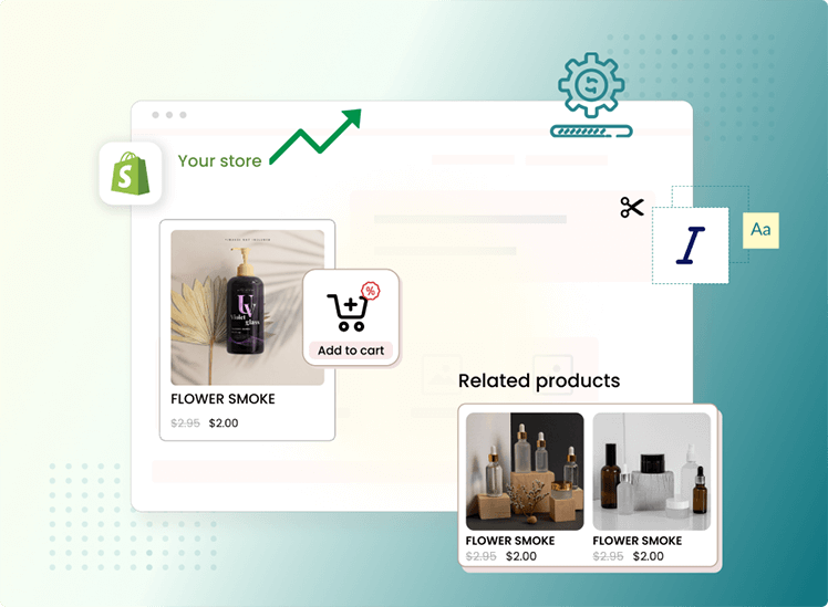
If you’re using a Shopify bundling app to create special offers like “Buy One Get One Free” or “Mix and Match Bundles,” responsive design becomes even more important. After all, bundles only sell if customers can see them clearly and add them to their cart without any hassle.
In this blog, we’ll explore why responsive design matters so much for bundling apps, how it affects sales, and what you can do to make sure your store delivers a smooth experience across all devices.
What Is Responsive Design?
Responsive design means that your store’s layout and features adjust automatically to fit different screen sizes. Instead of creating separate versions of your site for desktop and mobile, responsive design ensures that everything—from product images to checkout buttons—scales and reorganizes smoothly.
For example:
- On a laptop, customers may see bundles displayed in a grid.
- On a phone, that same grid might stack vertically for easier scrolling.
The idea is simple: no matter what device someone uses, your store should look great and be easy to use.
Why Responsive Design Matters for Bundling Apps?
Bundling apps are powerful tools for boosting sales. They allow you to group products together, create discounts, and encourage larger purchases. But if your bundling app isn’t responsive, it can hurt the shopping experience.
Here’s why:
- Most shoppers use mobile devices
Studies show that more than half of eCommerce traffic comes from mobile. If your bundle display doesn’t adjust properly, customers may leave without buying. - Bundles need clarity
Bundles often involve multiple products shown together. On a small screen, poor formatting can make bundles look messy or confusing. Responsive design ensures the layout stays clean and easy to understand. - Smooth checkout process
Even if customers like your bundle, a non-responsive checkout flow can make them abandon their cart. Responsive apps keep buttons, forms, and offers easy to tap and navigate. - Professional appearance builds trust
Shoppers are more likely to trust and buy from stores that look polished across devices. Responsive design shows professionalism and reliability.
Benefits of Responsive Bundling Apps
When your Shopify bundling app has responsive design, it brings several benefits:
1. Better User Experience
A responsive bundle looks clear, loads fast, and adjusts naturally to the screen. Customers don’t need to zoom in or struggle to find the “Add to Cart” button. This convenience often leads to more completed purchases.
2. Higher Conversion Rates
The easier it is for customers to understand and buy bundles, the more likely they are to purchase. Responsive design removes barriers and reduces cart abandonment.
3. Improved SEO Performance
Google favors mobile-friendly websites in search rankings. If your bundling app is responsive, your store has a better chance of showing up higher in search results, bringing in more organic traffic.
4. Consistent Branding Across Devices
Responsive design keeps your branding consistent whether someone views your store on a tablet or a phone. This builds a stronger connection with customers and reinforces trust.
Introducing Wizio Bundle: Quantity Breaks App
The Wizio Bundle: Quantity Breaks App stands out as a comprehensive and user-centric solution that excels in responsive design. With a focus on enhancing the user experience across devices, Wizio offers a range of features tailored to meet the evolving needs of Shopify store owners.
How to Ensure Your Bundling App Is Responsive?
Not all apps are created equal. Some bundling apps may look fine on desktop but struggle on mobile. Here’s what you can do:
1. Test on Multiple Devices
Before finalizing a bundling app, test it across different devices and screen sizes. See how your bundles appear on iPhones, Androids, and tablets.
2. Look for Mobile-Friendly Features
Choose apps that specifically mention “mobile-optimized” or “responsive design” in their features. These apps are built with mobile users in mind.
3. Keep Bundle Designs Simple
Too many products, large images, or complicated layouts can make bundles harder to navigate on smaller screens. Stick to clean, minimal designs.
4. Monitor Customer Behavior
Use tools like Shopify Analytics to see how mobile vs. desktop shoppers engage with your bundles. If mobile customers abandon carts often, it may be a design issue.
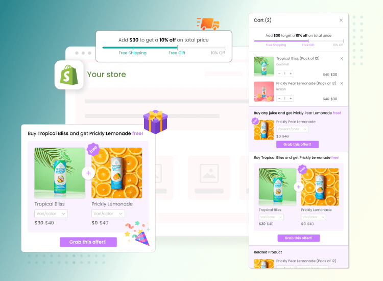
Real-World Example
Imagine you run a beauty store on Shopify and you offer a “Skincare Essentials Bundle” with three products.
- On desktop, the bundle looks beautiful with side-by-side product images.
- On mobile, if your bundling app isn’t responsive, the images overlap, the text gets cut off, and the “Buy Now” button is hard to tap.
The result? Customers leave out of frustration.
Now, if your bundling app is responsive:
- The images stack neatly, the text adjusts to fit, and the “Buy Now” button is clear and easy to click.
- Customers complete their purchase quickly, and your sales go up.
This simple difference highlights why responsive design is crucial.
Conclusion
Responsive design isn’t just a nice-to-have feature for Shopify bundling apps—it’s a necessity. With most customers shopping on mobile, a non-responsive bundle display can cost you sales and damage customer trust.
By choosing a responsive bundling app, testing across devices, and keeping designs simple, you ensure that every shopper—no matter what device they use—enjoys a smooth and professional experience.
In the end, responsive design doesn’t just improve how your store looks. It improves how your customers feel when shopping, and that directly impacts your bottom line.
Frequently Asked Questions
1. What is responsive design in Shopify bundling apps?
Ans: Responsive design means the bundle layout automatically adjusts to different screen sizes, making it easy to view and buy on mobile, tablet, or desktop.
2. Why is responsive design important for bundles?
Ans: Because most shoppers browse on mobile, and a non-responsive bundle can look messy, cause confusion, and lead to abandoned carts.
3. How does responsive design affect sales?
Ans: It improves user experience, reduces friction at checkout, and makes bundles easier to buy, which increases conversions.
4. Can responsive bundling apps improve SEO?
Ans: Yes, Google favors mobile-friendly websites, so a responsive bundling app can help your store rank higher and attract more traffic.
5. How can I check if my bundling app is responsive?
Test your store on different devices, check if layouts adjust smoothly, and look for apps that mention mobile-optimized features.